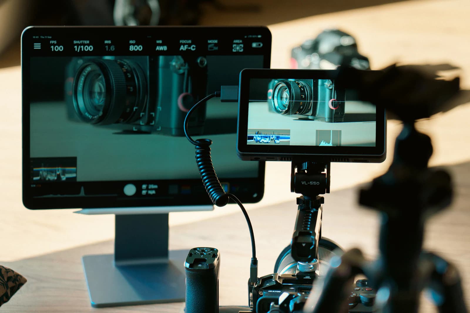
Your camera's LCD screen is a bad judge of exposure — its brightness changes with the ambient light around you, so a photo that looks perfectly exposed in a dim room can look badly overexposed the moment you step outside into sunlight. The histogram doesn't have that problem, and learning to read it is one of the fastest ways to stop guessing at exposure in the field.
What a Histogram Actually Shows
A histogram is a graph of every pixel in your photo, sorted by brightness. The horizontal axis runs from pure black on the far left to pure white on the far right, with every shade of gray in between. The vertical axis shows how many pixels in the image fall at each brightness level — a tall spike means a lot of pixels share that brightness, while a flat, empty stretch means very few pixels are that bright or dark.
Importantly, the histogram carries no information about where those pixels are in the frame, only how bright they are. A tall spike on the left could be a shadowed corner or an entirely black background; the shape alone won't tell you which.
Reading for Exposure Problems
The most useful thing a histogram does is show you clipping — detail that's been lost because it fell outside the range your camera's sensor can record. If the graph is piled up against the right edge of the frame, you're clipping highlights: parts of the image that were pure white with zero recoverable detail, no matter how good your editing software is. If it's piled up against the left edge, you're clipping shadows the same way, in pure black.
A small amount of clipping is often fine or even intentional — a light source in the frame, or deep shadow in a high-contrast scene, will naturally hit pure white or pure black and that's not a flaw. What you're watching for is a large pile-up against either edge on a scene where you expected detail to survive there, which tells you to adjust exposure before you move on rather than discovering the loss later on a bigger screen.
There's No Single "Correct" Shape
New photographers sometimes try to force every histogram into a centered bell curve, but that's a mistake — the "right" shape depends entirely on the scene. A photo of a white wall should have a histogram bunched toward the right. A photo of a black cat in a dark room should be bunched toward the left. A high-contrast scene with both deep shadow and bright sky might legitimately have data at both extremes with very little in the middle. The goal isn't a particular shape; it's making sure nothing is clipped that you didn't want clipped.
Using the Histogram in the Field
Most cameras can display a live or post-shot histogram, and many can overlay blinking "zebra" patterns directly on blown-out highlights. Get in the habit of checking the histogram, not just the preview image, after any shot where the lighting is tricky — backlit subjects, sunsets, interiors with bright windows. If you see clipping you didn't intend, adjust exposure compensation and reshoot rather than trusting that the file will look fine once you're home. Catching an exposure problem on location, when you can still fix it, is far better than catching it during editing when the shot is already gone.
The Numbers Behind the Graph
A standard 8-bit JPEG has 256 brightness levels, numbered 0 for black to 255 for white. The histogram is simply a count of how many pixels sit at each of those levels, usually grouped into a smaller number of bars so it fits on a small screen. Clipping means a large share of pixels sit at 0 or at 255.
Raw files are different and worth understanding. A 14-bit raw file records 16,384 levels, and the sensor is linear, so each stop of brightness takes half of what remains. The brightest stop gets 8,192 levels, the next 4,096, then 2,048, then 1,024. Add the top four stops together and you get 15,360 of 16,384 levels, about 94 percent of all the tonal data. That is why photographers push exposure as far right as they safely can: the bright end holds the most information and the cleanest tones, while the deep shadows hold very few levels and show noise first.
A Caveat: Your Histogram Is a Preview
The histogram on the back of most cameras is calculated from the small JPEG preview, which has your picture style, contrast and white balance baked in, not from the raw data. A raw file therefore often has a little more highlight room than the histogram suggests. If the graph just touches the right edge, a raw file may still be recoverable, but we would not rely on it. Treat a clearly clipped histogram as a warning, and a barely touching one as a judgment call.
Scenario: Bright Window Interior
We shoot a living room with a bright window. At the metered exposure the histogram shows a tall spike hard against the right edge, which is the window, and the room sits in the left third. Reduce exposure by one stop, which halves the light, and the spike pulls away from the edge so the sky regains detail, but the room becomes darker. Now we have a choice: accept a darker room, add fill light, or shoot a series. The exposure stops calculator shows the shutter, aperture and ISO combinations for a one-stop change, and the bracketing calculator helps plan a series that covers both ends.
Common Mistakes
- Trusting the preview image. A bright screen makes dark photos look fine, and a dim screen does the opposite.
- Chasing a bell curve. A snowy scene bunched to the right can be perfectly correct.
- Looking only at the combined graph. Many cameras offer an RGB histogram, and one color channel can clip, such as a saturated red flower, while the brightness graph looks safe.
- Shifting too far right. Pushing exposure to the edge protects shadows but can blow highlights you wanted to keep.
When the Histogram Doesn't Help
The histogram cannot tell us whether the composition works, whether the focus is sharp, or where in the frame the clipping happens. A small specular reflection on a car or a candle flame is meant to clip, and it will push a spike to the edge without harming the picture. Mixed lighting and strong creative choices, such as a deliberate silhouette, also produce unusual shapes that are correct for the intent. Use the graph together with the highlight warning, which shows where the clipping lies.
Quick Checklist
- Check the histogram, not just the picture
- Look for pile-ups at either edge
- Decide whether the clipped areas matter in this scene
- Use the RGB histogram for saturated colors
- Adjust exposure compensation and reshoot if needed
FAQ
Should my histogram touch both edges?
Not necessarily. It touches both only when the scene's range fills the sensor's range. A foggy morning will sit in the middle, and that is correct.
What is expose to the right?
It means increasing exposure until the histogram sits near the right edge without clipping, which gives cleaner shadows in raw files. It works best on static scenes where we have time to check.
Why does my histogram look different from my editing software?
The camera shows a preview with your picture style applied, while the software uses its own raw processing, so the shapes can differ a little.